
As a print professional, choosing the right color system prevents costly reprints. Here’s how CMYK, Pantone®, and RGB differ – and when to use each.
1. RGB: Digital-Only Colors
- What it is: Additive color model (Red, Green, Blue) for screens
- Print Pitfalls:
- 30%+ colors become muted when converted to CMYK
- Neon greens/oranges often print muddy
- Golden Rule: Never send RGB files for printing
2. CMYK: Standard Process Printing
- What it is: Subtractive 4-color system (Cyan, Magenta, Yellow, Black)
- Best For:
- Full-color brochures/catalogs
- Budget projects (>90% of commercial print)
- Limitations:
✘ Can’t match exact brand colors
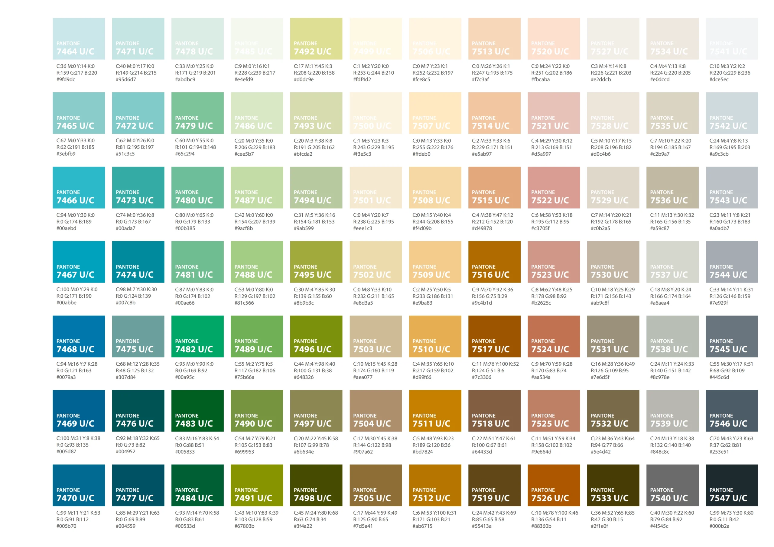
✘ No metallics/fluorescents - Pantone® (PMS): Spot Color Precision
- What it is: Pre-mixed ink system with 2,000+ colors
- When to Use:
- Brand-critical logos (e.g., Coca-Cola® red = PMS 485)
- Metallic/gold printing (e.g., awards)
- Avoiding color drift across print runs
- Cost Note: Higher cost (additional ink plates), ideal for 1-3 colors.
Print Pro’s Decision Cheat Sheet:
| Project Type | Recommended System | Why? |
| Product packaging | Pantone® + CMYK | Brand accuracy + photo colors |
| Event flyers | CMYK only | 40% ink cost reduction |
| Web-to-print ads | Design in CMYK | Avoid conversion disasters |
| Luxury Invitations | Pantone® Spot | Metallic/foil stamping effects |
| Stickers | CMYK | Cost efficiency |
Colors displayed are digital simulations. For accurate matching, refer to physical PANTONE guides under standard lighting.